Wednesday, November 21, 2007

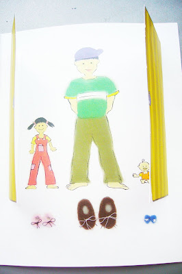
Finished Storybook, complete with additional decorations

Main material used to decorate book - felt cloth


Finished Storybook


Finally, the storybook is created!
After printing the book, our group decided the book needed something more, to increase its appeal to young readers. It soon struck us, that young children needed tactile interaction with the book. Therefore, we started experimenting with various materials, and finally used felt cloth, plastic eyes and glitter glue to decorate the images.
Different coloured felt cloth are cut and pasted onto the pages, and for one particular page, we cut out a cardboard door, for the young reader to be able to interact with.
Reflections:
My group was presented with a cash prize for being the best storybook in class, during the last nm2208 lecture. It was certainly a pleasant surprise, nothing as delightful as hearing other people sing praises of your hard work.
A lot of work has been put into the storybook, from story conceptualisation, to the final output. The assignment allowed me to experience a taste of satisfaction, seeing your ideas materialising from your own imagination, to digital format, and finally into something you're able to hold. Also, I got to apply all the design principles I had learnt in the previous lectures and assignments into creating the storybook.
Most importantly, I learnt how to create a professional design document and I recognised its importance, in terms of keeping me on track with what we wanted to achieve and the steps taken towards it. A constant need to justify the many decisions involved in the design process, allowed us to take a step back and re-confirm if we were making the right choices.
In all, this storybook assignment, was certainly a memorable and enriching experience.

Tuesday, November 20, 2007

PROJECT STORYBOOK
(final images, with colour and text. in digital format)
Note: some colours came out different because of technical problems.


Some of the colours are coming out all wrong due to some problem with blogger. Been trying my hardest and wasting a lot of time trying to rectify it, but nothing seems to solve the problem. Technology can be such a pain sometimes.

Reflections:


For every colour that I used for the storybook images, I had to relate back to whether it fits our theme of a soft, dreamy, watercolour feel. Shades of colours had to be chosen with care, to prevent clashing and to ensure consistency, something that had been stressed on by tutors for this particular project.


Choice of font was a tedious process, as my group tried out all possible fonts, not wanting to miss out on any better-suited font for our storybook. Although it was troublesome, we all agreed that it was necessary to use the best apt font, as font would affect the entire outlook of the storybook. Text is a vital part of any storybook, and they are being paid much attention to by the reader. Choice of font would determine and contribute to the overall theme of the storybook, as different fonts exuded very different characteristics. This was also evident from the exercise we did in class, of matching the correct shoe to its correct brand.


Finally, text and image had to be arranged. Since consistency was frequently emphasised, we decided to use a layout which had either text on top and image below, or text below and image on top, throughout for our storybook pages. There were only two exceptions. One in which we had two blocks of text which we placed side by side with the image, and another which we had an image which spread over two pages, and the text was placed on the image itself.


More on concept development will be discussed in the design document.
PROJECT STORYBOOK
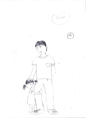
(sketches)


These are our rough sketches on paper, after much research and brainstorming. Me and my project mates, Karen and Cheryl, decided to work on a simple, sweet story, mainly teaching about BIG and SMALL things in life. More information about how we generated this concept, can be found in the learning journal! :)
Reflections: Projects always sound so much fun when you hear about it, but only when you really start to work on something together, especially something as subjective as design, conflicts will surely arise. For me, there were times when our group could not agree on decisions such as, how our main character should look like, or if we should include the puppy, or if our words sounded better one way or the other. Everyone had her own opinions and personal ideals of how the storybook should be, which made it difficult to come to a consensus. However, as it dawned on us all that it was clearly impossible to please all, the only way to move on and really get our project started, was to give and take. Sometimes you have to accept someone else's opinions, and do things their way, and sometimes you'll have to insist on your own way when you feel really strongly about it, and hope that the others will give way then. It wasn't easy to gauge when you have to give, and when to take, but things all finally fell into place, and we had our concept finalised. I believe such principles of teamwork will apply when it comes to the workplace next time, especially as I'm aspiring to work in an advertising firm, there would definitely be opportunities to work in a team to generate advertising concepts.

Monday, November 12, 2007

Assignment 6a : Design Analysis
Pair Presentation


Reflections :
After presenting to the class, a fellow classmate and the tutor both reflected the idea that they did not feel that my example of a bad poster, was in fact an appropriate choice.

In my presentation, i had focused on how cluttered the poster was, with the lack of negative space, and its overwhelming use of block shapes and fonts. I then concluded that this was an ineffective, and thus a bad poster.

However, I had failed to realise what my classmate and tutor had recognised, that the poster was designed with the aim of achieving a gritty, old-movies feel, in which bold colours and various shapes framing text and images were often used.

The crucial lesson here is, that there is more to a design than just fulfilling the design principles in theory. Not satisfying the principles does not necessarily result in a bad design, just as fulfilling them does not guarantee a good design. Desired feel of the poster would have to be considered, while using the design principles as guidelines.


Assignment 6B (Individual Presentation)


The last slide is a dummy website I created, in place of the original website, and in accordance with the proposed improvements I listed. I used Photoshop to put the website together, and took images taken from the university itself.
Reflections:
Both assignments 6a and 6b really benefitted me a lot, especially in terms of technical terms which would be rather useful in explaining design. Terms like unity, asymmetrical/symmetrical balance, dominance teach about the theoretical tactics for design.
Now, i no longer have to use layman terms and give vague descriptions of why a particular design appeals to me. That's why theory is useful, it provides one with technical terms to explain why one design would be more effective and visually-pleasing as compared to another, and also, it provides basic guidelines to follow in design.
Of course, as reflected from the comments received about assignment 6a, there are always exceptions.