Draft 1, 2, 3 : Stop Social Phobia

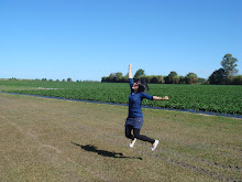
This photograph is of my brother (again! :D) and it is used as the main and only image in the poster.
Draft 1

Text is then added in.
Draft 2

The poster is photoshopped to create a more gritty feel, and a spotlight is placed near the top right corner, to enhance the aesthetics of the poster.
Draft 3

A blue hue is added, however it might be mistaken to portray a 'underwater' ambience, which is not what was intended.
Draft 4 : Stop Depression
The theme was changed from stopping social phobia to stopping depression, as general opinions from friends reveal that they thought the poster was about depression, rather than social phobia.

The blue hue was replaced with a greenish black hue. This creates an overall gloomy effect, which was in coherence with the theme of the poster.
The text was reduced to only one line, as I realised that too much text actually distracted the viewer and provided little focus. Also, the poster left a more lasting impression on viewers with this one-line, rather than with the long block of text.
Final Draft
The text was re-arranged. The portion, "never meant to be for life" was placed in the spotlight's beam, to promote focus on these words. Also, alignment of text allows eyes to travel from top to bottom of the poster, and finally end off reading the phone number given, in small text.
Comments:
Friends all approved of my poster, some even commended that it looked rather professional. :D
Reflections:
This assignment allowed me to reflect on what posters should (and should not) incorporate in order to achieve its purpose.
A poster is often created to convey a specific meaning, with the intended function to persuade, inform, to warn etc. Specific methods should be used in accordance with the intended function. For example, a poster which is used to warn, should capture attention by using bright colours.
Everything in a poster should serve a purpose, or else it should be considered redundant and removed. Posters are often placed on walls, and so attention given to it is very short. Any irrelevant information or elements will discourage the viewer from further viewing the poster, and a poster which nobody looks at, is a poster which has failed. Blocks of text which only tires the reader and diminishes interest should be deleted. Images which steal attention from the main object of interest should be edited or removed, to prevent distraction.
The font of any text in the poster, should reflect the theme of the poster. Consistency is a crucial determinant in constructing an effective and visually pleasing poster.
+copy.jpg)

No comments:
Post a Comment