Draft Two of Assignment One
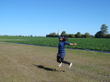
I love being around nature. (spelling out JOCE)
I love being around nature. (spelling out JOCE)


the top image (in white) is a pencil-drawn sketch, which i scanned in and made edits with Photoshop, to result in the second image (in black).
I hate the pressures of life.

the background replica of the iron, was to create a looming effect which would serve the purpose of further emphasising on the overbearing and larger-than-life pressures. Black, white and shades of grey, were the only colours used to illustrate the fact that i HATED the pressures of life.
Comments: I had thought these would be the final sketches, but alas for the second one, EVERYONE thought i loved ironing (which is actually kinda true, hmm.) instead of i hate pressure. I changed it from the previous egg image to that of the ironing, which depicts my name being flattened by the iron, to illustrate pressures being exerted on me. But i guess trying to convey such an abstract idea was too ambitious a task, so i'll be changing the entire theme to something else (i contemplated keeping the image and just changing the theme to 'I love ironing', but that seems like cheating, so oh well.)
For the first 'i love nature' image, comments were generally positive, yay! Some even commended that the drawing was pretty, which was really heartwarming after some really long hours of sketching, and getting pencil marks and eraser shavings everywhere. hee. So i guess the first image would be my final work already. (thankfully :p)
/edited!!
I hate being in cramped spaces.

and so, the final sketch of the i-hate assignment!!
Honestly, there is just something irksome with being stuck in a place (think a bus, or train) with virtually zero space to move, and having to be in skin-to-skin contact with the next stranger beside me. Multiply the whole degree of disgust by hundred, if the stranger is sweating/stinking(mostly the first two characteristics come together)/making weird jerking actions. So there, the justification for my edited sketch.
This was how it initially looked like. Okay, good for you if you've noticed that this is one of the thumbnail sketches in my very first sketch. But it's my design afterall, and that can't be considered plagarism right. Plus, i did think it was a good design, which carried a strong visual message, and should thus, not be neglected and left in the dumps of the first sketch. :P

I used Photoshop to erase all the pencil markings scanned in, and to fill the image with colours using Brush function, and Magic Wand.
When i was sketching this thumbnail, i was thinking more along the lines of pressure, and that led me to imagine being compressed from all sides, hence the image. I added the lock to further emphasise on how it was impossible to be relieved from all that pressure, and compression. And that I(my name) was being caged in, and given no space to breathe. Lastly, the lock also served to tell the reader that the pressure wasn't created by myself, but an external source. But as mentioned previously, 'i hate pressures of life' is too abstract a concept, so to narrow it down, one of such pressures would be being stuck in cramped places almost everyday when you have to be in crowded transportation areas during rush hour. and so, the theme changed to 'i hate being in cramped spaces.'
Comments: All my peers whom i've shown this to, guessed correctly what the image was trying to convey on no more than three tries. Brilliant!! :D
No comments:
Post a Comment